Enterprise WordPress plugin development (we are the experts here at Adigi in producing these) refers to the process of creating custom plugins specifically tailored for large-scale WordPress websites. Just so we have cleared that up lots of businesses, brands and organisations we work with have...

At Adigi, we’re passionate about working with brands that share our appreciation for intelligent design, innovation, and long-term thinking. One of the most rewarding examples of this is our enduring partnership with NaughtOne �...

At Adigi, we’ve worked with ambitious brands across hospitality, lifestyle, and enterprise — and one thing’s clear: the best results come from long-term partnerships, not ticking clocks. Historically, many agencies have o...
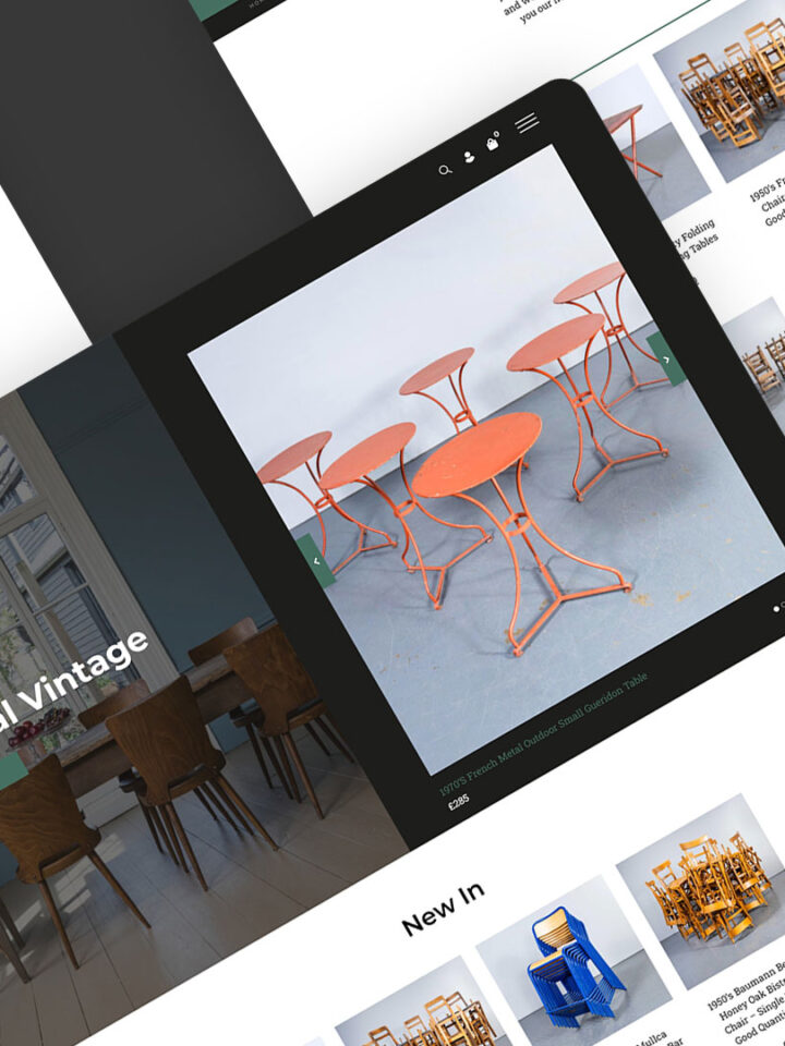
When it comes to launching an online store, WooCommerce and Shopify are two of the most powerful and widely-used platforms on the market. As experts in both frameworks, we often get asked: Which one is better? The answer? It de...
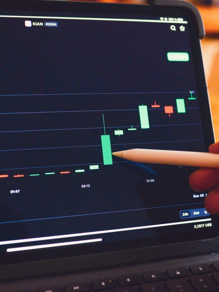
For any brand with an enterprise-level WordPress site, getting traffic is only half the battle — turning that traffic into action is where the real results lie. At Adigi, we build and optimise high-performance WordPress sites...
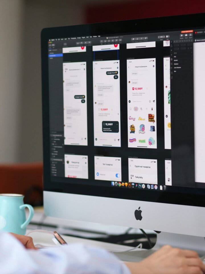
A well-structured sitemap is the foundation of an effective website. Whether you’re designing a new site or optimising an existing one, sitemap consultancy plays a crucial role in enhancing user experience, improving SEO, and ul...
Sign up for updates, special offers & more
The organisation is committed to achieving equality for women, girls, and marginalised groups within family-related laws, policies, and practices, recognising the diversity of families, religions, and cultures. They believe that governments worldwide have a duty to protect and promote the rights of women and girls within family life and law. By reforming family law, they aim to create a foundation for gender equality, both nationally and globally.
Introduced by our agency partner, We Are Boutique, we worked with Best Heating specifically on integrating Klaviyo into their website and implementing an effective email marketing strategy.
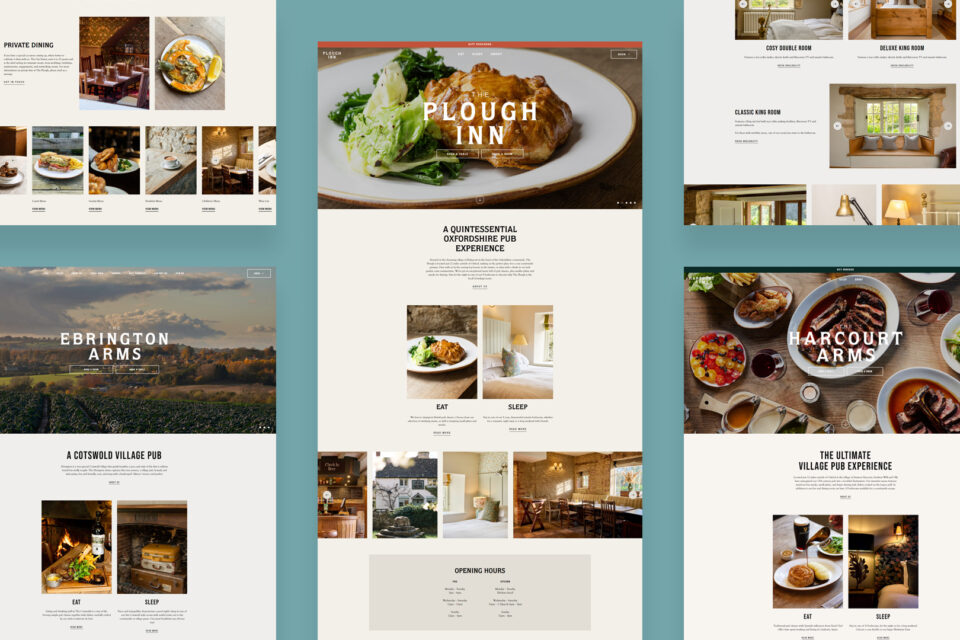
We worked on the entire proposition from the branding, including typography and colour palette, website design and website development. Combining a sense of modernism whilst still remaining sensitive to the history and locality of the pub throughout the project process.
The main goal of the website is to raise awareness of the Acorn; it’s currently such a hidden gem. There’s courses that you can attend including yoga events, mindfulness and cooking workshops and retreats plus the everyday treatments by wonderful therapists. We wanted to showcase the space online and also make it easier than ever to book a treatment or course. The new website really reflects who the Acorn are, their team and their wellness and wellbeing ethos.
We worked on the entire proposition for The Craven Heifer. For the branding, focus was placed on creating synergy between the existing exterior signage, the logo and body font whilst adding some Yorkshire personality with the scripted headers. The colour palette needed to be bold, characterful like the pub and owners, and the orange accent colour worked really well to highlight key touch points cross the site. As orange is featured across the pub’s interior design, it was fitting to introduce this across the site and create consistency between a user’s online and offline experience.
We underwent a brand relaunch for Distinctive Inns, creating them a timeless logo and icon that sits across sites, uniforms and more. The latest pub opening followed, as did the website launch and then came the photoshoot. Three days took us on a whirlwind photoshoot around Nottingham visiting the pubs and shooting location, interiors, food, customers and bar.
We were honoured to work with Weston Hall, a historic venue in Yorkshire that is, and always has been, a family home. Our brief incorporated the branding, website design and development for this digital project. Using the historic coat of arms, our designers drew a logo to create synergy between the coat of arms and the site. We create a brand guide, complete with fonts and colours that embodied the history and heritage of Weston Hall and focused the design of the website to highlight the story of the Hall, the key features and buildings, gallery and annual opening times for visitors.
The website needed to encapsulate many areas of the estate – from the history of the property and owners to the events that can be hosted there. This came with a particular emphasis on weddings, with such a stunning venue, we’re positive it will attract couples from all over the country to Yorkshire’s next big wedding venue. With the estate in the background of photos, we can see why!
We worked to refresh the existing branding and create additional brand touchpoints throughout the new website design and build project to enhance the online experience and create an effective user journey. Focus was placed on showcasing the key lodge features and virtual tours, core services, the abundance of wildlife and opportunities to explore what’s on in the local area.
As The Boar’s Head is within the Ripley Castle Estate, the team wished to ensure that the colour palette and branding was aligned with the Ripley Castle’s website whilst still displaying its own identity and character. Our key deliverables included designing and building a new website that effectively communicated the Coaching Inn’s history, their accommodation and dining features.
We were delighted to work on the entire proposition for The Bell Hotel, from the branding, website design and website development. Our focus was to create a brand that brought a sense of modernism whilst still remaining sensitive to the history of the hotel. We looked to represent the local Suffolk area whilst appealing to a wider audience through the use of the chosen colour palette, fonts and interactive page designs.
The KISS team worked on the new brand creation and website design to capture this unique, social gaming experience for adults. We focused on the UX / UI, front end and back end development of the project. In order to bring the design to life, the online experience of Lane7 needed to reflect the branding through engaging, immersive and captivating UX/UI throughout the front end development stage.
From updating the existing logo, we worked on expanding the brand further to incorporate new fonts, colours, textures and assets that could be incorporated into the new website design.
A key part of the brief was to create a playful, engaging website design to portray the brand’s offering and vision that was aligned with the different sessions, opportunities and events that Born of the Forest host. Focus was placed on designing a streamlined, effective user journey where users could easily explore the key services on offer and how these are broken down based on age groups.
Using the new branding, a key part of the design was to ensure that the master colours became an integral feature of the site. We also introduced some feature graphics to reflect the brand and create a great aesthetic look and feel to the core page designs.
Creating an automated carousel at the top of the site was a key way to showcase key photography and engage the user when landing on the site. We then created a user friendly menu to showcase the core services including the Hotel, Tykes Restaurant, Golf, Weddings, Special Occasions & Conferences so that users could quickly filter through to any area of interest.
We designed and built a website for Ripley Castle which is very image and video led that best shows the various aspects of the castle and grounds which truly make it unique. The drone video on the homepage banner best showed the castle to a scale a static photo couldn’t – the whole castle and grounds are incredible and we needed to convey that to a potential visitor, event booker and couple looking for a wedding venue.
Through our branding process, focus was placed on capturing the atmosphere of the Cotswolds and the history of The Inn that started life 350 years ago as a malt house whilst developing a more bold, modern look and feel that captured the evolution of the Inn that Adam and his team, including Head Chef Matt Weedon have created.
The website needed to reflect the hotel; providing something a little quirky whilst keeping in mind that ultimately, the website needs to convert users into bookings. Working on their branding, photography, online positioning, website design and build, this has been a really fun project for us and we’re so happy with the outcome.
The website needed to reflect the personalised details within the properties. From the curated menus to the quirky interiors with the attention to detail the Pearman’s are renowned for. Each property keeps their surroundings in mind and uses a consistent design structure so that users can easily navigate key areas of the site.
The KISS team worked on the new brand creation and website design to capture this unique, experiential gaming offering for the whole family. We focused on the UX / UI, front end and back end development of the project. In order to bring the design to life, the online experience of Level X needed to reflect the branding through engaging, immersive and captivating UX/UI throughout the front end development stage.
The website is often the first interaction a potential customer or stockist has with the brand. Working alongside the strategic brand and packaging agency CHILLI, they created the new branding and website designs for us to then bring to life online through the website development on WordPress. Emphasis was placed on creating an engaging user interface with an effective product filtering design so that users could easily discover the variety of products available.
Working with Tom and his team, we created an ecommerce website which both builds Tom’s online presence as a well known chef and TV personality, but also sells his products direct to consumer.
Alongside the brand refresh, this project was an exciting opportunity as the team wanted to introduce ecommerce into the new website so that customers could order directly via the website. Using WooCommerce, we worked to create a user friendly, engaging customer experience that shared the brand’s history, their new feature kitchen and allowed users to purchase certain products.
For this project, we worked in collaboration with our agency partner, KISS Branding. The KISS team created the new logo, brand identity and colour palette for the brand. From their initial visuals, we worked on the sitemap, the website design, front end development and back end development in WordPress.
Taking the existing brand and core colours of black, gold and white, we extended the brand to introduce the product to the UK market. We needed to retain the heritage of the brand whilst introducing engagement, textures, patterns and additional colours to elevate the look and feel for a UK audience.
As part of the brief, we refreshed the branding to create a more modern, cohesive look whilst maintaining the traditional heritage of the brand. We then worked to design and build a woocommerce website that focuses on a clear user navigation and site structure, that aids conversion so that users can easily make purchases through the site, and sparks engagement and acts as a source of inspiration through the development of an ‘Inspiration’ page to really set them apart.
Creating them a brand new website, we used their existing well known branding to create a bespoke solution which is more in keeping with their business.
With the project we rebranded the logo and brand identity, the brief being to create a user friendly experience for parents, patients and clinicians to navigate to the relevant sections with limited clicks.
Keeping the brand’s logo and colour palette, our key deliverables included designing and building a new website that effectively communicated who the company is, demonstrated their expertise and commitment to providing solutions to water pollution.
We worked on the entire proposition, for Oyster Logistics, from their new branding to the website design and website development in WordPress.
The new branding concept included logo, logo identity across multiple channels, typography and colour palette. The team wanted to still reference and nod to their original logo, but with a new fresh and modern approach. We wanted to create a bold, engaging brand identity that represented their mission, values and services as a true logistics partner for their customers.
Since 2010, Breathe has built a solid reputation for delivering energy and carbon reduction, infrastructure renewal, operating cost savings and improved building environments for clients. The website and branding needed to reflect the work they did and so we worked to create a site which would bring the proposition to life and engage the user.
A dynamic, straight talking team, they stand out from competition, so their brand and their online presence needs to too. The website therefore needed to explain their services whilst being approachable and friendly, aiming to convert a user into a switcher!
Working alongside the communications consultancy, Ceriph, we designed and developed a new website for Bring Heart that focused on engagement, driving their key messaging and mission in a cohesive, informative way whilst encouraging users to join their team and view the latest job vacancies.
We worked to ensure that the design focused users on their two main services Labels & Labelling, and Print Management. Particular attention was also given to segmenting the various industries that Venture are specialised in working with and to provide the opportunity to demonstrate their case studies within each area.
We set about updating the branding. The design needed to create a mark and style that felt industrially sculpted but with a creative flair and more current edge in line with Hague’s personality. In an industry full of ink the design needed to embody bold, captivating colours that would work both online and importantly – in print!
Taking the existing Apollo logo, we worked with the group to evolve and expand upon their brand to create a complete brand identity, reflect the business, their offering and range of car finance products.
Taking their brand guidelines, we worked with Excel water throughout the design and development project process to help define their sitemap, accounting for key services, solutions and varying levels of content whilst creating structure and balance across the site.
Creating a lifestyle image led website which showcases their products in situ, we wanted to reflect their high quality products with a website to match.
Working with the Elliott team to create a project that works for them and represents them online to their full potential both in terms of brand and their work.
Whilst wishing to retaining a nod to the heritage of the brand, we refreshed the fonts, colours and brand icon graphic.
The main purpose of the website is to showcase the properties online. Therefore, throughout the entire design and build, we had to keep in mind how a user would research their dream home online.
Taking their existing branding, we were first tasked with the design and front end development using Bootstrap 4 of their website which incorporates the Vehicle Parts section where users can search, find and add parts to their basket and checkout.
Lorem ipsum dolor sit amet, consectetur adipiscing elit, sed do eiusmod tempor incididunt ut labore et dolore magna aliqua. Ut enim ad minim veniam, quis nostrud exercitation ullamco laboris nisi ut aliquip ex ea commodo consequat.
Keeping the brand’s logo and colour palette, our key deliverables included designing and building a new website for NEXUS that was user friendly, clean and simple to navigate, and focused the user journey on the main areas of the business.
Building a website with our friends at Boutique was a lot of fun for us. Using a collaborative approach, it was ultimately lots of fun to bounce ideas from one creative agency to another and we couldn’t have been happier with the result, which was launched to match their new brand direction.
Following Source’s board restructure and development of their new proposition, they needed a website that could reflect the fresh direction of the business. From providing creative direction on their branding and photography, to strategic support and consultancy on the site’s structure, sitemap, wireframes and conveying their new client proposition online.
KISS came to us with their new branding and website design, and we set to work on the front and back end development of the site.
Taking their brand guidelines, we worked with Excel water throughout the design and development project process to help define their sitemap, accounting for key services, solutions and varying levels of content whilst creating structure and balance across the site.
In collaboration with Boutique (our partner agency), we worked on the website design and website development in WordPress.
We were appointed to work on their entire proposition, including new branding, website design, website development, photography and email marketing design.
Our role was to bring the brand to life online with the website design, front end development and website build.
Taking the existing branding and turning it into a recognisable icon, we wanted to make the website a shopping experience where the user can search for whatever they’re looking for through multiple methods.
Our key deliverables were to create an image-led, user friendly experience that not only communicated who the company is, but demonstrated their expertise in global seafood procurement and their commitment to building strong, collaborative partnerships with their customers.
The brief on this website was to make a more engaging, conversion focused ecommerce website. Highlighting the brand, gin flavours, cocktails and experiences, we wanted to give equal weight to the important areas of the brand.
Our role was to help bring their branding vision to life online and showcase both their Ted Todd and Woodworks brands, whilst integrating brand touches to subtly distinguish across both brands to create a cohesive brand journey.
We worked on the entire proposition for Morgan Clare, from their new branding, to the website design, ecommerce website development, email marketing, photography direction and CRM integration
As part of the project, Brown & Newirth® seeked to implement a brand refresh and evolution across their online channels. We worked with them to breathe new life into the website through the implementation of their updated brand guide, including updated colour palette and typography into our website design process. Through the development stage, we worked with, and integrated their third party insurance providers framework.
Using the new branding, a key part of the design was to ensure that the master colours became an integral and immersive feature of the site.
The brief was to create an area that is their shop window online, a place that shows users where their products can be bought and recipes to keep users engaged and coming back to the site. Working in collaboration with Chilli-UK on this project, we brought skills from both agencies together to achieve a project that we’re all really proud of.
The brief was to create a clean and effective user journey to showcase the Cubitt House group and present their nine locations that each provided consistency in terms of their UX/UI, whilst still showcasing their own individually branded logos, colours, menus and photography.
Working in collaboration with Daylesford Stays who supplied new brand guidelines for Daylesford Stays, and each of their traditional Cotswold locations of The Wild Rabbit, The Cottages, The Fox, The Bell and The Three Horseshoes, we designed and built each of their websites.
