Ultimately, branding is completely subjective. We all have different style offline, with various choices in terms of fashion and interior design; the online world is no different in terms of personal style. We create branding for a wealth of clients and that personal style can’t help but leak through – which is why sometimes it is such a complex process in completing a redesign; in one company’s team, there could be four polar opposite views. That’s not only in terms of design but also in their perception of the brand. That’s why perhaps when notable, well known brands redesign their logo, many feel it’s a bad move or one that they want to talk about online as they perceive it to not sit in line with the brand. If the brand is well known, national or international, each member of the public will have a different viewpoint on what that brand means to them, the style they follow and their brand message.
We see branding everywhere whether it’s purposeful or not – from walking down the high street to brand recognition in the supermarket. We therefore do become a little attached to our favourite branding; some of them have been around for years and others are more recent but just as well loved. You only need to play the ‘Logo game’ at Christmas to show you that you actually know a number of really niche brands! If you think of Nike you think of the tick, you think of Chanel and you connect it to the interlocking CC logo. The question here is would you frown at Nike deciding to ditch the swoosh tick? It reportedly cost $35 in 1971 to create the logo – today Nike sits on the top 100 most valuable brands in the world at number 25. We know the brand isn’t just it’s logo but did you know that the ‘swoosh’ is linked to the brand name – Nike was the Greek goddess of victory – an inspiration to Greek warriors who said ‘Nike’ to each other when they won a war. The swoosh or tick takes shape from the same goddess. The branding is so simple but effective and has got huge familiarity now worldwide.
Indeed locally, we saw the fallout when Leeds United proposed it’s new club crest – now with a delayed launch until the 2019- 2020 season which we will see if it comes into play. There were over 77,000 signatures that were against the new crest. The club listened and are reviewing the new crest logo – but it was a launch no one could foresee would cause such an uproar.
There is so much to consider when rebranding – or creating a new brand. You have to begin with what a brand is wanting to say, the image they want to portray, the industry it sits in and so much more. For example, when BT redesigned its logo, whilst initially we all did stare at in wonder (especially when we saw the resemblance to our own ‘a’ icon!) after some thought we realised it works perfectly. Branding has to work across platform and also sectors of the business. BT for example has to work for their BT TV as well as BT Sport, broadband etc. The stripped back new logo will allow it to sit in place next to every strand of the business, both now and going forward.
Creating a new brand is one thing, but on a heritage brand with a well known and loved logo – the online world can really push back against it. The great thing with social media is immediate feedback but it can also easily snowball into a negative launch. When Burberry changed their logo from the heritage Burberry London with the Equestrian Knight centuries old logo into a more bold font with just the brand name, there was lots of online feedback. Some just thought it too simplistic and others mourned the loss of the heritage of the brand. Burberry followed the trend set by Yves Saint Laurent branding change – they dropped to just Saint Laurent about six years ago now. That settled into being chic and fashionable but there’s no denying that it’s often still referred to – perhaps not on the FROW but certainly amongst the normal folk – as YSL. It takes determination and a clear vision to alter such an iconic brand.
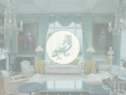
Your branding is your identity and what you might well be remembered as by audiences. A heritage brand can often come hand in hand with integrity, history and – sometimes – luxury. We recently worked on rebrand for a stately home, Birdsall Estates. Working with the estate owners, we knew they wanted to give a more modern edge to Birdsall without stripping away the heritage. We were conscious all the way through the process that we would never want to disregard the heritage – both of the building nor the family. The property was built in the late 16th century and remodelled in 1749, recently modernised in some areas such as new bridal suites. To bridge the history and modern edge, we presented clean, fuss free branding – and gave a nod to their well known and beautiful ballroom interior with the duck egg colouring. The owl was one of the family crests, so were tasked with modernising it and making it work online. We debated back and forth about creating a new modern owl logo to replace the historical one – did the historical owl look too grumpy and was the chain surrounding it really something we wanted within the branding? We made small tweaks, removing the chain and ever so slightly softening features but ultimate decided that in this instance, when we have such a beautiful heritage piece, why would we ever want to destroy that with too much modern thinking? There’s beauty in the heritage and that’s to be remembered – or at least paid homage to with new branding. We would never want to strip the equity in that out of any business or branding.
When a redesign is needed, we’re always open to a collaborative approach with clients. We’ll ask questions around the heritage and origins of the brand, where you’re wanting to push the brand to, what the culture of the brand is and what you’re wanting to portray with the new branding. Future proofing the brand is important to us. There’s nothing worse than changing the branding and/or brand name and then in a few years time deciding it’s not quite right anymore and changing it again. It becomes a Snoop Dogg type situation – is he Snoop Lion now? Big Snoop? Snoopzilla? Which name is cool these days? We want to give you one brand that you can stick to and build from – not putting a branding in place that would ever act as a glass ceiling for your brand.
So whilst we understand that customers and fans of a brand, when looking at new branding can – and should! – have opinions about new branding, we’d ask you to think about it before you Tweet. Constructive criticism is always wanted but it’s too simplistic of thinking to simply say the branding work will have taken 15 minutes because branding is so much more than that. It’s a misconception that it’s an easy job. But – and it’s a big but – rebranding needs to encapsulate the brand. It needs to be bold and stand out in the market, work with all strands of the business, be future proof, be memorable and so much more. The thinking and planning that go into logo design is strategic and shouldn’t be forgotten when you see the final result!
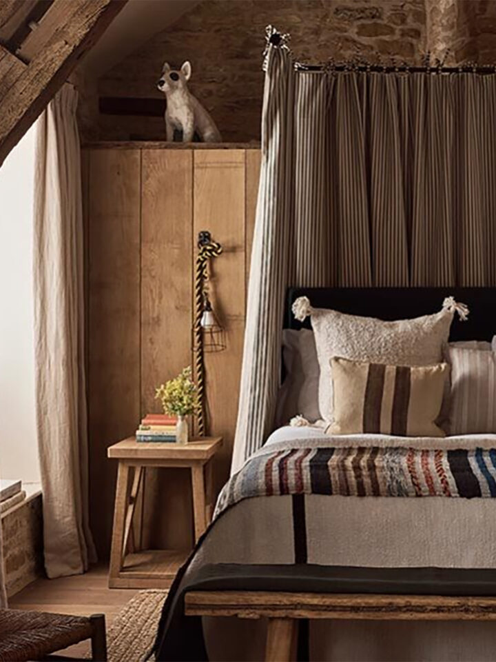
Header image and featured image: Birdsall Estates


