

For Christmas, we thought we’d do something a little different this year, so we teamed up with our wonderful friends at Maude Coffee to share this delicious festive experiment.
With a common passion for coffee, this Christmas was the perfect opportunity to work with our friends at Maude Coffee to share some festive cheer! At Maude Coffee Roasters, they’re all about spreading the good vibes and great coffee. Nestled in Leeds, they not only are passionate about roasting top-notch, small batch specialty coffee – but they also care about their sourcing, packaging, waste, process and impact.
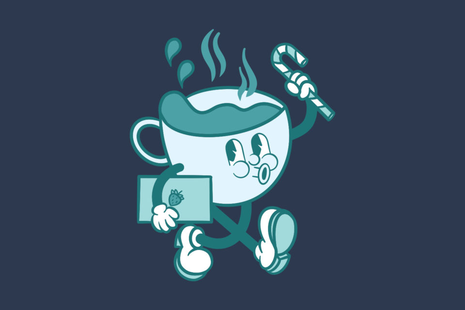
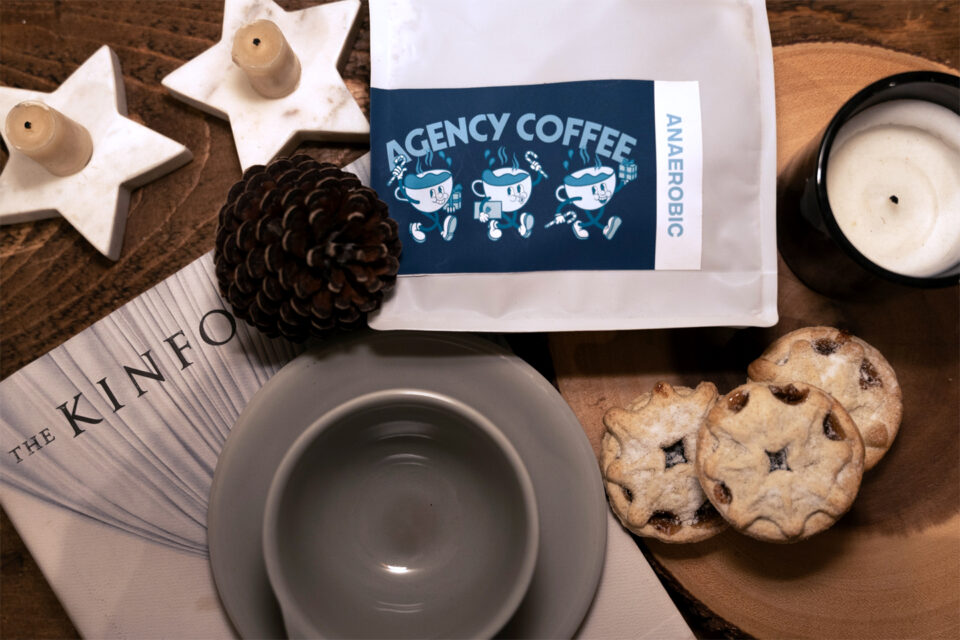
Following the launch of our new website and the evolution our branding, we wanted to ensure that throughout this mini creative project we created synergy in the design process to showcase our new brand palette and typography. With the foundations in place, we then added some extra festive character through the creation of hand drawn illustrations and our custom ‘Agency Coffee’ logo to evoke a sense of fun, engagement and that worked in a rounded, label inspired format.
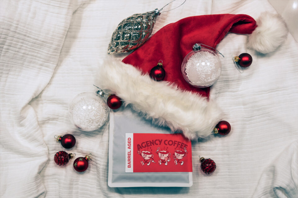
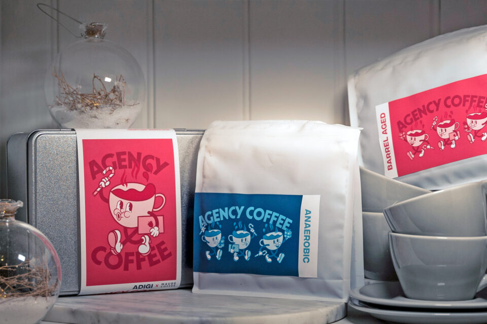
Having received a sample of the packaging, labelling and coffee from our friends at Maude Coffee, we wanted to strike a balance between ensuring that our clients could understand all key information around the Barrel Aged and Anaerobic coffee that we would expect from a product, including Description, Type, Origin, Notes, Producer, Process, Altitude – whilst still maximising on the print space to include our Adigi Christmas message, add our QR code and add illustrations throughout the design.
The design process and label design was split into two main segments. The outer packaging box which had our ADIGI outer label with our main Agency Coffee cover illustration, showcasing our partnership with Maude Coffee, including our Christmas message, and ensuring that our QR code was clear to ensure clients headed to our Christmas website page. From there, the design then focused on the two distinct coffee flavours. To ensure the Barrel Aged coffee and the Anaerobic coffee each had their own identity, it was fitting to use our two brand colours of pink and blue to create individualism between one another, whilst still creating consistency with our brand and the outer packaging.
Big thank you for the Christmas treats that arrived this morning!
The team have already cracked open the present, and we all absolutely loved your ADIGI branding on the coffee.