








The best brief we ever received from an interior designer: “Make it feel like our showroom.” That’s it. Six words.
But it said everything.
When you walk into a great interior design showroom—curated, calm, immersive, detailed—every surface tells you something about the studio’s standards. That is exactly what a great interior design or commercial product website should do.
It shouldn’t be an image-heavy gallery that loads slowly and leaves you guessing. It shouldn’t be a corporate-feeling ‘About’ page that could belong to any studio. And it definitely shouldn’t treat a contact form as an uninspired final act of a premium brand experience.
The best interior and product design websites have one thing in common: they feel designed. Every spacing decision, every typographic choice, and every image crop communicates the brand’s exact level of attention to detail. Potential clients and architects are looking for exactly that evidence.
The Challenge of the Interior Product Market
In the high-end interior product market—where physical texture, scale, and craftsmanship rule—translating a tactile product onto a digital screen is notoriously difficult. If a user can’t touch the fabric or sit in the chair, the interface itself must evoke the premium quality of the physical object.
At Adigi, when we take on an interior design or product brief, we start by spending time in the client’s world—their work, their language, their references. The website has to come from that place. Two distinct projects perfectly illustrate how this philosophy comes to life across the interior product ecosystem: NaughtOne and TextileMania.
NaughtOne: Absolute Simplicity, Infinite Possibility
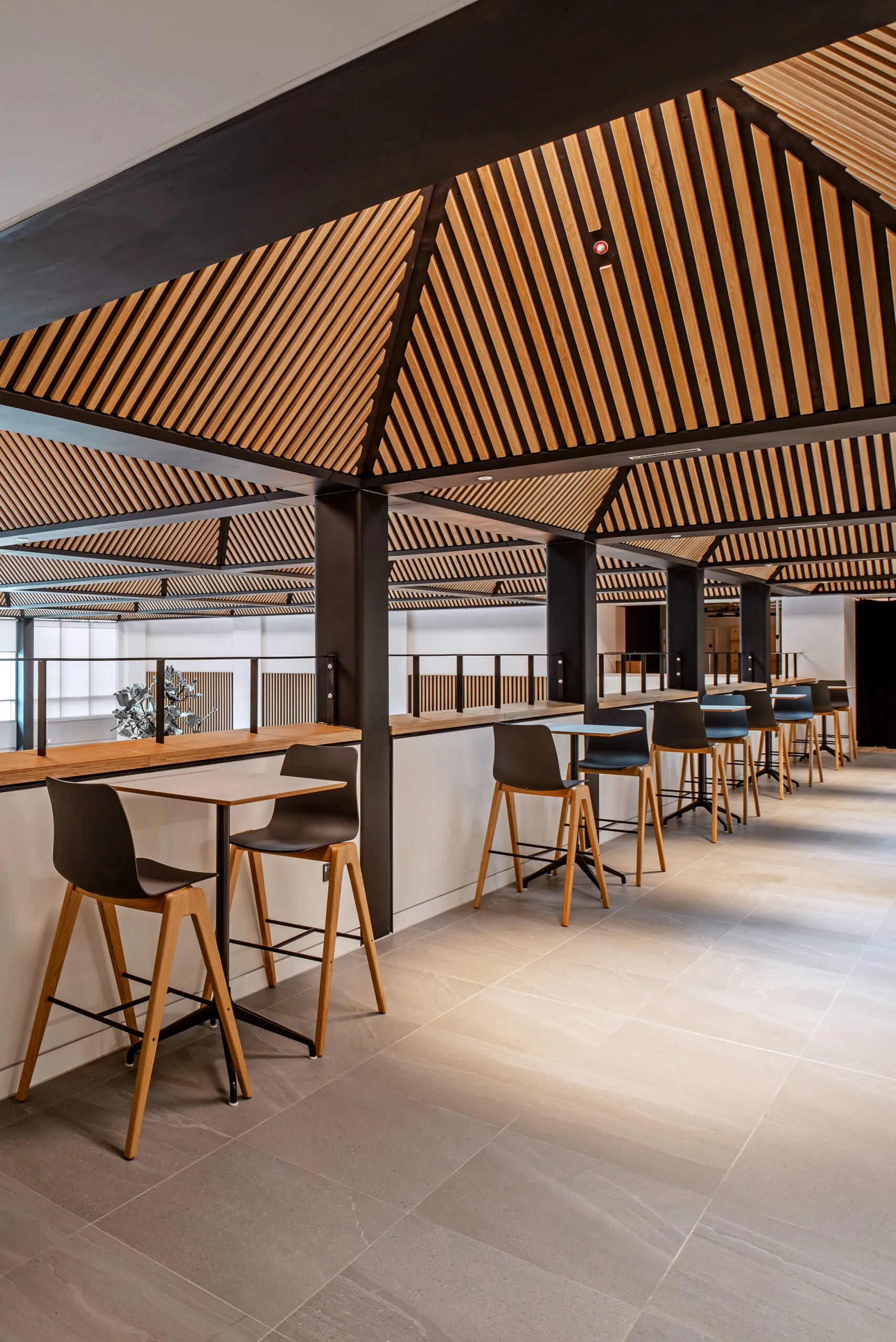
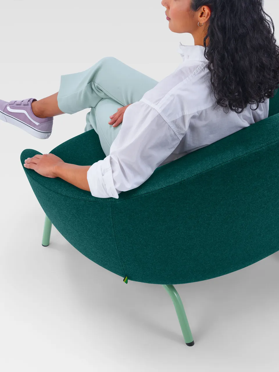
As a British design powerhouse, NaughtOne manufactures beautiful furniture used in some of the most influential offices globally, from LinkedIn to Microsoft. The digital challenge here was showcasing the immense utility and aesthetic of their furniture without overwhelming commercial buyers.
Our focus was on translating their “absolute simplicity” into digital performance. By structuring a case study-driven architecture alongside high-fidelity imagery, the website allows designers to see products in situ. It doesn’t just display a catalogue; it mirrors the effortless, functional elegance you feel when sitting in one of their chairs.
TextileMania: Bringing Tactility to Tech
For over 30 years, TextileMania has supplied premium, low-environmental-impact textiles to the built environment. When they expanded to new global markets and relocated to the UK, their digital platform needed to do more than list fabric swatches—it needed to inspire.
To solve the tactile dilemma, we designed a unique, interactive Inspiration page for their WooCommerce platform. Users don’t just scroll; they can filter by pattern, texture, or colour, and physically drag their favourite lifestyle and architectural images to the top of the page to curate their own digital mood board. It mirrors the exact process a designer goes through in a material library, bringing the showroom directly to the screen.
Designing with Intent
The interior product market moves fast, but premium brands can’t rely on fleeting web design trends or bloated plugins. True luxury online is built on seamless user experience, lightning-fast load speeds, and intuitive product filtering.
Whether we are showcasing custom furniture ranges or technical fabric specifications, the digital shop window must act as a natural extension of the brand. When a website is built with the same precision an interior designer applies to a spatial layout, it ceases to feel like a tool. It becomes an environment.