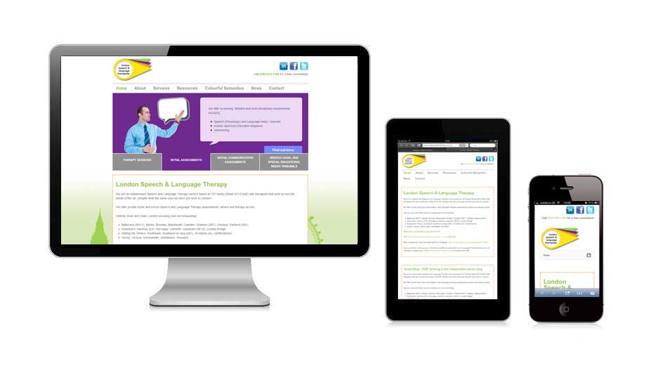
Is your website responsive for devices such as tablets and mobile phones? If it was built over 3 years ago then the answer will probably be no. With such a small proportion of the traffic on our clients being viewed by these devices it was something that could potentially be ignored, not any more. With over 10% of our clients traffic coming from these devices it is essential to cater for the traffic that is viewing the website.
The shift from the PC to mobile and tablet devices is obviously very real, and meaningful, particularly in the case of Facebook, which is seeing the gap between PC users and smartphone users narrow, month on month.
Consumers are still using their computers for many of the core PC-centric activities.” 73% of PC owners still use their PCs to browse the internet, for instance, compared to 61% and 53% for smartphones and tablets, respectively. So there’s still a huge market for serving consumers accessing the internet through a desktop experience.
A good solution we have recently seen is pcworld.co.uk website, this renders on all three devices (mobile, tablet and desktop machines). The constraints of the website have been negated by the fluid way that this website is intuitive to the visitors device.

Currently we are working on a number of responsive designs for customers, contact us to talk about your responsive website design project.


